Most of photographers already know a little about the texture slider that Adobe added to Lightroom Classic in the release of version 8.3 in May 2019. In this episode I want to try and help photographers know what the Texture slider does and when and how to use it.
Where Is the Texture Slider?
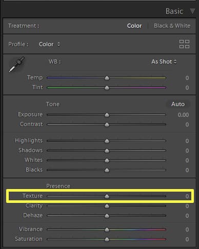
Let’s start with where photographers can find the slider. It is a slider that is only available to Creative Cloud subscribers. If you update Lightroom Classic to version 8.3 (which I have given my Photo Taco seal of approval to use), you will find the Texture slider in the Develop module. It is in the Presence section of the Basic panel just above Clarity and Dehaze, which should give a little bit of clue about how the slider works to photographers who have been using the Clarity and Dehaze sliders for a while.
This new Texture slider is also in the newer version of Lightroom on the desktop, the “cloudy” version as Victoria likes to call it. It was added in Lightroom version 2.3. You can find it under Effects in the Edit panel (the first icon in the upper right).
You can also use the slider in Photoshop through Adobe Camera Raw where it will be in about the same spot with Clarity and Dehaze. This is something that a lot of photographers don’t actually know where Adobe Camera Raw brings all of the slider functionality in the Develop module to Lightroom. The Camera Raw engine is available as a plug-in for Photoshop and Bridge, and it’s built into all of the Lightroom apps.
What Does the Texture Slider in Lightroom Do?
We have described where the slider is, now let’s talk about what you can do with it. The slider defaults to 0 with the handle to the slider right in the middle which means you can move it right and left. Victoria, we are going to talk in a second about the difference between Texture and Clarity and even Sharpening but let’s focus just on what the Texture slider does when you take it to the right or to the left.
I am going to encourage all of the listeners to read the blog post that Max Wendt wrote on Adobe’s site for a pretty good explanation with example images of how it is the Texture slider works. Max talks about frequencies in images with high, medium, and low frequencies and says that Texture finds and enhances or smooths out the medium frequencies.
Frequency isn’t a term we often use as photographers. Essentially, it allows the developers to separate a photo into multiple layers of different size details, so they can treat them differently. Frequency separation for beauty retouching is a simplified version, where the detail on the face is separated from the underlying color and tone.
High frequency is when a pattern repeats itself very often in the photo. Noise in a photo is a good example. Even though it isn’t a perfectly repeating pattern, noise is made up of tiny little details repeated over and over or with a lot of frequency in the image.
Low frequency is the exact opposite. These would be the distinct edges of larger objects in a photo. The edges of a persons facial features like their nose, eyes, mouth, for example.
If you want to dive into more detail on this concept of frequencies in an image, check out the Spatial Frequencies in Photography article for a pretty good explanation.
The new Texture tool focuses on the medium size details in an image. The frequencies between the high and low. It doesn’t affect the large smooth areas, and it largely ignores the smallest details like noise, focusing on the real detail and textures in the photo.
How is Texture Different From Clarity?
I have absolutely loved using the Texture slider to post-process my photos. I love that I have another tool I can use to adjust my images so that I can realize the creative vision I have for them. One of the things that wasn’t completely clear about as I went into using Texture was exactly how it is different from Clarity. After all, they are placed right next to each other in the panel.
You don’t have to wait for podcasts, YouTube videos, or blog posts on a new feature in order to figure out what it does. When something new comes out for your photo editing software you should play around with it and take the new feature to extremes you would NEVER use as a final product but shows you what that feature is doing to your image.
This is what I did to really make it clear to me the difference between Texture and Clarity. This is exactly what Max did such a great job of illustrating in his blog post for Adobe as well. I recommend you give the same experiment a try. As I played around with Clarity on a large number of images and took it all the way to the right (please don’t leave photos this way) the effects to the contrast are easily seen.
Clarity affects a wide range of detail sizes so it affects the overall contrast and saturation of the photo, which can quickly start to look unnatural if you’re not careful. The effect Clarity has on your photo may very well be exactly what you want in some cases, though after adding some Clarity you may need to revisit the Tone section (Exposure, Contrast, Highlights, Shadows, Whites, Blacks) of the Basic panel.
On the other hand, positive Texture (moving the Texture slider to the right) really brings out the details in textures, hence the name of the slider. It does this without the significant effect on contrast that Clarity has. Texture focuses on smaller mid-size details and sort of a 3D feel to the photo without changing the overall contrast.
The effect of Texture is more subtle than Clarity and in many cases you can push Texture to 100 or beyond without introducing artifacts. Plus, Texture will mostly leave noise in the photo alone where moving Clarity to the right tends to increase the presence of noise.
With all of the sliders in Lightroom, you may need to zoom into 1:1 to see it properly and the zoom back out to check you haven’t overdone it. I highly recommend this is how you decide where to set your sliders as the 1:1 view is a more accurate representation of what the effect will be than you get zoomed out.
How Is Texture Different from Sharpening?
The other adjustment that seems similar to Texture is Sharpening. In fact, if it was up to Victoria she would have put the Texture slider in the Details panel with the Sharpening sliders because to her the effect of Texture is far closer to Sharpening than to Clarity.
Sharpening focuses on really small details. We often want to get the small details in our photos to look sharper by moving that Sharpening Amount slider to the right. In fact, if you shoot raw, your photo is so in need of sharpening that Lightroom will automatically add a little for you by default just to replicate the sharpness you have in a JPEG from your camera. This is not about sharpening, a topic for another day, but let’s just say that you will most likely want to add some sharpening to every photo.
You can certainly take sharpening too far very easily and it can end up sharpening noise as well as real image detail. As Max pointed out in his blog post, there is a good reason why there is a Masking slider in the sharpening section of the Details panel in Lightroom. Sharpening needs to be added to our photos, both while processing and on output, but while editing it has to be done selectively and not applied equally to all areas of the photo. Again, an topic for another day.
Texture may feel a lot like sharpening as you apply it, but it is a more mild control because Texture ignores the very smallest details. Positive Texture (moving it to the right) adds a crispness to the image, especially the parts you would call “texture”, without the image becoming crunchy. Negative Texture (moving it to the left), softens the “texture” in the photo like softening skin without making it look unnaturally smooth.
When Should the Texture Slider Be Used?
Unlike some of the other sliders in Lightroom where if you use them you do so very sparingly, every photographer should experiment with the Texture slider on every photo. After you get your exposure the way you want it Texture should be the next slider you play with, certainly before Clarity and Sharpening.
In a positive direction, Texture is incredibly versatile. Great for landscapes and seascapes. For example, Texture does an incredible job of enhancing the spray of water coming off a crashing wave. Texture works well for architecture or B&W photography, where you’re wanting to enhance textures without going overboard on contrast. Anywhere you previously used positive Clarity, try Texture first and then add a little Clarity, and you’ll get a more natural result.
You might also want to use Texture locally. For example, brush it over someone’s eyes to define their eyelashes. If the global slider doesn’t go far enough for your liking, you can even add multiple gradient or brush pins to increase the effect further.
In a negative direction, use it locally rather than globally. Put a radial filter over a person’s face, and then brush away their eyes, hair and other details you want to keep sharp. It will even out the skin tones but retain the fine lines and skin texture that makes us look human. Too much negative Clarity had a tendency to create Barbie dolls, whereas Texture is much more natural.
Victoria Bampton, The Lightroom Queen
I want to thank Victoria for joining me on this episode and helping me to explain the new Texture slider. If you enjoyed the episode you will want to check out her site over at https://www.lightroomqueen.com/. Victoria has a lot of free content that is sure to help photographers learn how to use Lightroom better.
Victoria also has a book I can highly recommend as one that has helped me learn how to use Lightroom. It is called Adobe Lightroom – Edit Like a Pro and at $24.95 it is a steal of a deal. She keeps the book updated as Adobe adds new features to Lightroom and for that price you get a year’s subscription to those updates.
If you want to connect with Victoria on social media, and I recommend you do, you can find her on Facebook and Twitter as well.
Reminders
- Photo Taco Facebook group, ask to join and write “Jeff Harmon” or “Victoria Bampton” as the name of the host.
- Follow the show on Instagram @phototacopodast or Jeff’s personal account @harmonjeff
- Follow the show on Twitter @phototaco or Jeff’s personal account @harmon_jeff
- Send email suggestions on show topics to phototacopodcast@gmail.com
- Check out the other podcasts on the Master Photography Network over at masterphotographypodcast.com
Podcast: Download (Duration: 32:09 — 22.1MB) | Embed

Comments
Interesting and informative – Thanks
So your post is about repeating other people’s opinions just when you are ready to describe what something does.
Not very useful.
I guess the entire discussion about frequencies in photos and how Texture targets the “medium” details which is different from clarity and sharpening doesn’t count. You didn’t make it past the link to Adobe’s blog link I guess. Oh well, can’t please everyone.
Very interesting and useful! Very well presented with the right presenters on the show. Thanks for this. And I enjoy the deeper insights into the technology that you present. I’ve upgraded my Lightroom and Photoshop versions as a result.