Color space is something many photographers struggle with. I think the photography community makes this harder than it needs to be. So much photo editing software offers color space configuration with zero explanation of what it means. Here it is in simple terms.
Color space doesn’t matter in the capture phase, should be Adobe RGB in the working phase, and sRGB in the output phase of most photography workflows.
I was inspired to do this episode by a recent blog post and video from my good friend, Greg Benz. He does an incredible job of explaining all of the Photoshop configuration options related to color space, but I wanted to take it a little further and address color space throughout a photography workflow. By workflow, I mean the color space to use at the capture, working, and output phases.
Color Spaces – sRGB vs Adobe RGB vs ProPhoto RGB
If you have never heard the terms sRGB and Adobe RGB before, there are plenty of excellent resources on the Internet to help with that. I really want to cover the color space workflow aspects and not spend a lot of time on defining the color spaces themselves, so let’s make this a very simple and fast explanation.
First off, don’t get bogged down or worry at all about the math that is part of color spaces. Color spaces were not made for photographers and photographers don’t need to understand everything about them. Don’t worry about the 3D charts that show the gamut of colors in each of the color spaces and get derailed thinking you have to make sense of that.
Let’s make an analogy of color spaces to spoken language. A 10 year old has a certain vocabulary they can use to describe the world they live in and can only do so much to express things using words. A college student has more years of experience and learning behind them, an increased vocabulary at their disposal, and can therefore be more expressive. Then you have a college professor who has spent their life studying a subject matter and can express ideas with ultimate expression and clarity.
The sRGB color space is sort of like the language skills of a 10 year old. It is limited in how the data from your camera sensor can be represented, less expression of color, or in technical terms a smaller “gamut”. Don’t worry about that word, “gamut”, but it does mean that sRGB won’t accurately express all of the colors your camera captures. That sounds bad, and it can be, but you will most likely end up using it a lot in your workflow. You just have to make sure you use it correctly.
Like sRGB, Adobe RGB as a color profile is dated and in some cases may not be able to FULLY express all of the colors from your camera sensor. However, Adobe RGB is so close to fully representing the colors your camera sensor captures that practically speaking you should consider it as covering everything. In other words, Adobe RGB is really good for photographers and should be part of your workflow.
To get a little more specific, Adobe RGB allows more cyan, green, and yellow colors to be expressed over what sRGB provides. These are principal colors needed for many landscape photos and if you use sRGB as your color space too early (the working phase) then you may not get everything out of the image you could have. You still may end up going to the sRGB color space at the end of your workflow (the output phase), but here in late 2020 photographers should work in Adobe RGB.
ProPhoto RGB is a color space that allows the expression of all colors from your camera sensor, and then some. Sounds great right? ProPhoto RGB is a color space that allows you to use every color your camera captures. It can be that if you dive into color space and really dig to understand it. Otherwise, ProPhoto RGB is more likely to be handled improperly and may cause more problems than it solves.
What Color Space Should Photographers Shoot With?
Most cameras have the choice between sRGB and Adobe RGB. Which should photographers choose? The answer is going to surprise many of you, it doesn’t matter. Like many settings in your camera, if you shoot raw images instead of JPEG it doesn’t matter which color profile you choose. The only impact the in-camera color space setting has on your images if you shoot raw is how the histogram looks while you are shooting, which is why I still set it to Adobe RGB since I plan to work in that color space.
Shooting raw means you are gathering all of the data from the sensor without any interpretation. It is the raw data. That data does not include any kind of a color profile, it is the raw color information that was gathered by the camera sensor without any color profile information.
If you are reading this article, or listening to the podcast, you should be shooting raw. There are very few use cases, like maybe a sports photographer on a tight timeline, where it makes sense to shoot JPEG only (raw+JPEG is great). Though if you do decide to shoot JPEG only, you should use the sRGB color space.
Photographers should choose sRGB when shooting JPEG only because that image is likely going to be used outside of your control and there are just too many ways a JPEG shot with an Adobe RGB color space will not be interpreted correctly. You run the risk of not having the colors in your image look the way you want them to, so go down to the lowest common denominator where no matter how the image is used the colors will be rendered correctly with the sRGB color space.
What Color Space Should Photographers Edit With?
Now let’s move to the working phase and what color space photographers should use while editing their photos. Let’s assume you start with Lightroom Classic and maybe take some of the images into Photoshop for the purposes of this discussion.
If you want to dig deeper, you can check out this information from Adobe on how Lightroom Classic deals with color space, but the bottom line for photographers is you don’t do anything with color space in Lightroom Classic. At least not until you leave Lightroom Classic, like to round-trip a photo in Photoshop or export your adjustments.
At that point you need to make sure you have configured Lightroom to use the color space and bit depth you want. This is configured in Edit>Preferences>External Editing (Windows) | Lightroom>Preferences>External Editing (Mac).
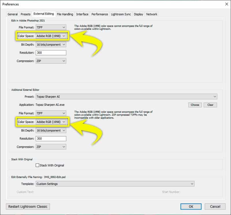
Both the Adobe RGB and ProPhoto RGB color spaces are a good choice for your working color space while editing images, but most photographers should choose Adobe RGB. Using ProPhoto RGB can give a photographer more to work with, but also requires extra knowledge about color that simply isn’t worth the time investment for the small amount of benefit. The thing to avoid is using sRGB as the color space in the working phase if you shoot raw.
Another thing to consider in deciding on your color space (Adobe RGB vs ProPhoto RGB) is compatibility with plugins. There is one specific use case I have personally dealt with where ProPhoto RGB should not be used – green screen photography.
The green portion of the color space expands enough in ProPhoto RGB that green screen plugins, like EZ Green Screen from Pixnub, don’t work very well. I asked about this with the guy who develops EZ Green Screen plugin and he says that it is enough of a problem that he is going to code the plugin to not work if the color space of the image is ProPhoto RGB.
What Color Space Should Photographers Output (Export) To?
Finally, the last phase of the workflow, the output phase. The safest bet is the lowest common denominator where an sRGB JPEG file is going to work everywhere. Even though it won’t represent every color your camera captured, as long as you worked in the Adobe RGB color space, downgrading the color space to sRGB for your output files is going to work really well.
sRGB For The Internet and Digital Downloads
If you are going to put the photo on the web, there is really no other choice here in late 2020. You have to export your images with the sRGB color profile. There are some services, like Instagram for example, where other color spaces like P3 can be used because so many phones have a display that supports that color space, but it really isn’t so much of a difference it is worth worrying about. The Internet means an sRGB color space.
The same goes for digital download deliveries to clients. If you provide digital images to your clients as part of your service, you should use the sRGB color profile. So many applications don’t actually read the color profile that is embedded in an image and just assume it is sRGB. If you send an image that has the Adobe RGB color profile to a client they may look at it using software that doesn’t properly handle the color space and the colors are likely to look different than what you worked so hard to do.
If your exported images have the chance of being both downloaded and printed (discussed below), you should choose the profile that is going to work best for the broadest possible usage – sRGB.
BONUS TIP: Another important aspect to giving yourself the best possible chance to have things look good for your client when they view a digital download of your work is to use a good monitor with high gamut and calibrate your display.
sRGB or Adobe RGB (Maybe) For Printing
If you are printing to your own printer you don’t have to worry about the color space of an exported file. You don’t have to export a file at all. You can print straight from Lightroom or Photoshop and the color management will be handled. However, if you are going to send an image file off to a lab for printing then you have to export the processing of the image out to a file and that export needs to have a color profile assigned.
The safest bet with print labs is also going to be sRGB. Without question every lab supports images with sRGB color profiles and for most client printing (especially portraits) this is going to work great. Some print labs may also support images exported with the Adobe RGB color space as long as that profile is embedded in the image so that it can be recognized.
If you shoot raw (and you should), you work in Adobe RGB (and you should), and you are printing landscapes where there are probably more colors that are more critical than they might be in portraits, it is worth finding out if the lab supports Adobe RGB. Otherwise it probably isn’t really worth your time and you should just export your images with the sRGB profile.
If you do want to see about using the Adobe RGB color space for printing, the trick may be in finding out what the print lab really supports. You could call the lab and some of them may be able to answer that question, but be careful about it because the person that answers the phone at a lab is usually not qualified to answer this kind of a question.
You could ask to speak with a technician who knows about color space, but what might be even better is just testing it out yourself. Send two images off to the printer. Export one with an sRGB color profile and the other Adobe RGB. Have the lab print both on something small and inexpensive, like maybe a 5×7. Best to choose an image that has a lot of color, like a sunset/sunrise or other landscape photo. Otherwise the test may not show much.
How to Choose a Color Space When Exporting Images
Now that you know which color space you should use in the output phase of your workflow, how do you do that in the software?
Here are the steps to choosing a color profile when exporting your images in Lightroom Classic:
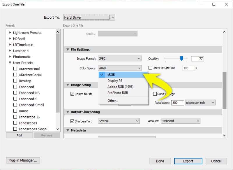
- Select the image(s) you want to export
- File > Export (or right click on an image and choose Export > Export…)
- Find the “File Settings” section of the export dialog box
- Choose your file format (JPEG is most likely the best option to make the image useable anywhere, though TIFF is a good choice if you want to maintain raw capabilities of your image)
- In the Color Space drop down choose the profile you want to use (sRGB unless you know for sure you are sending this image to something that can handle Adobe RGB)
- Choose all of the other settings you want to use in the export
The easiest way to export your images sharpened and sized for the web is in Photoshop is the FREE Web Sharpen script from Greg Benz. If you would rather do it yourself, here are the steps if you are exporting to a JPEG and want to use the sRGB profile from Photoshop:
- Edit your image in Photoshop (use the Adobe RGB color profile while editing the image)
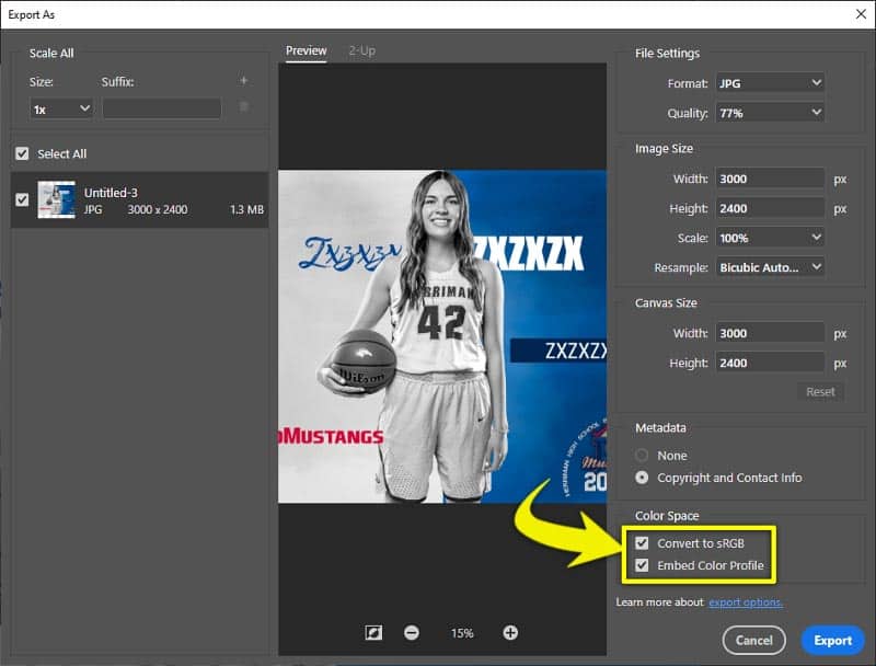
- When you are ready to export, File > Export > Export As…
- Choose JPEG for Format
- In the Color Space section check both of the “Convert to sRGB” and “Embed Color Profile” checkboxes
- Choose the rest of the settings you want in your export
Here are the steps if you want to export to JPEG with the Adobe RGB color space from Photoshop:
- Edit your image in Photoshop (use the Adobe RGB color profile while editing the image)
- Save your file with all the layers as your master file so that you won’t lose anything if you make a mistake (might be best to do Image > Duplicate.. to make a copy of all the layers to a new document and then do the rest on that document)
- If you have used a ProPhoto RGB color space you need to convert the image to the Adobe RGB color space by doing Edit > Convert to Profile… > and choose a Destination Space of Adobe RGB
- If you want the export to be a smaller resolution than the original, use Image > Image Size to change the pixel dimensions to what you want the output file to be
- File > Save As
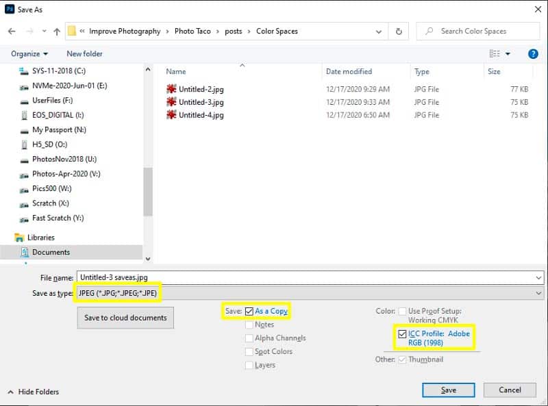
- Choose Save as type to be “JPEG (*.JPG, *.JPEG, *.JPE)”
- Make sure the “Save: As a copy” and “ICC Profile: Adobe RGB (1998)” checkbox is selected
Why Does My JPEG Look Different Outside of Lightroom/Photoshop?
After following all of the advice given here, you still may struggle when you go to look at your exported photo and the colors seem different than you saw them in Lightroom or Photoshop. This is a perfect example of why it is using sRGB for your exported images is a very good idea.
Other than photo editing applications, where great care has been taken to make sure color profiles are utilized, most applications that allow you to view images are not “color managed”. They don’t actually read the color profile information from the image, even when you have done what you should from this guide to embed that color profile into the image. They assume the image is sRGB and interpret the image that way no matter what the embedded profile says.
That explains why when you export an image with an Adobe RGB color space the colors may look different in many image viewing applications when they aren’t color managed. What about if you export to sRGB and you still see the colors look different? It still comes down to a lack of color profile awareness, but this time it is the calibration profile used with your monitor. If you don’t calibrate your monitor you won’t see this. You also won’t see your colors like they will print.
Photo editing tools are color managed. They respect both the calibration profile used with your monitor and the color space you are working with in order to show you accurate colors (as long as you have a good monitor that can show a wide gamut). Nearly all non-photo editing applications do not consider either. They assume sRGB and ignore everything else.
This is more likely to be an issue on Windows than it is on Mac, though there are definitely Mac applications that are not color managed. Both the Finder and Preview applications on Mac are color managed. Neither Windows (File) Explorer nor the Photos applications are fully color profile aware. None of the web browsers on any platform are color managed either, so colors are going to look different there.
The best color managed application that will accurately display the colors of your exported images outside of your photo editing tool for Windows is IrfanView (choose 64-bit).
Color Space Podcast Episode
Check out the Master Photography podcast episode on this topic with Jeff and Greg Benz.
Comments
Hello,
Thank you for this very interesting article.
Something is still unclear for me regarding my Workflow and Color Management
Monitor BENQ SW2700PT calibrated with Spyder Pro => So I have have another Color Profile than the pre-configured ones (AdobeRGB, sRGB), Named “BENQ SW2700PT Color Profile,D6500”
Windows is using this Color Profile (BENQ SW2700PT Color Profile,D6500)
I shoot with Sony A7RIV then import and rework a bit under lightroom, then edit in Photoshop, then back in Lightroom, then export in JPEG to display on website, Instagram, …
So I have:
1) Sony A 7RIV Shoot RAW+JPEG – Color Space sRGB (To have directly my JPEG in sRGB if I want to send them directly on Instagram)
2) Open and Edit a bit the RAW on Ligthroom – Color Space Adobe RGB (1998) – 16 Bits set in Lightroom preference ||| But my screen is using the color profile resulting of the calibration (“BENQ SW2700PT Color Profile,D6500”)
3) Edit from Ligthroom to Photoshop
As this moment, I have an Alert Windows “Embedded Profile Mismatch” asking me if I want:
Embedded: Adobe RGB (1998)
Working: Monitor RGB – BENQ SW2700PT Color Profile,D6500
– Use the embedded profile (instead of the working space)
– Convert document’s colors to the working space
– Discard the embedded profile (don’t color manage)
And here, I don’t know what to chose?
.
.
.
.
.
After I’m back to Ligthroom
4) I export from Ligthroom in JPEG with conversion to sRGB
So my questions are:
1) What should I chose in the “Embedded Profile Mismatch” window?
2) Why?
3) Is there anything else wrong in my worflow?
Thank you in advance
RG
After reading the article, I realize I still have to learn so many things. However, I learned about Adobe RGB and ProPhoto RGB. And I learned that both choices are good when working with color space while editing images.
Very explicit article about exporting images using both, Adobe RGB and ProPhoto RGB.
Great information. I have a question though.
Q: The color space in my workflow is set as default (Adobe RGB (1998) the Depth: is 8 Bits/Channel, so should I just leave it at that Depth or change it to 16 Bits?
@Elibeth stick with what your source has. If the source of the image is 16 then stay with 16. If it is 8 then you don’t really get a lot of benefit “upscaling” the 8 bit to 16.
Thanks for your article!
I’ve a question: do you think it is worth doing two different post-productions in LR, one for exporting AdobeRGB and one for sRGB? – assuming you have a wide-gamut monitor that allows you to switch between two color profiles.
Or do you think the differences between exported AdobeRGB and sRGB JPEGs are pretty minimal that one can simply work in AdobeRGB and export to sRGB with no changes?