
Lightroom Hardware Testing Project Update
Still working on this. I know that is disappointing to many of the listeners because it meant I didn’t get an episode out in August 2019. I really thought I would be close to finishing up the testing I am doing of the Develop module in Lightroom and what the impact of hardware is on performance. It is just taking longer than I expected and I have had several client shoots come up.
I don’t have anything to talk about yet on the testing I have done. I want to get more scientific on my testing approach even though it is going to be manual testing. While I continue to work on that testing, rest assured that the advice I give to photographers on computer hardware worth investing in is being influenced by the testing I have done.
Lightroom Classic 8.4 – Photo Taco Seal of Approval!
Enough time has passed without significant issues being reported to me or in the Adobe forums for the most current release as of this episode in mid-September 2019 for Lightroom Classic 8.4 such that I can give my Photo Taco seal of approval for the update.
Most photographers should not have issues upgrading to Lightroom Classic 8.4. The largest issue I have seen is one where a small number of photographers have had Lightroom Classic 8.4 hang when launching the program. If you experience this issue you should rollback to Lightroom Classic 8.3 until a fix is released.
Best Background for Composites
I talked about a recent client shoot I did where the client needed me to match the look of a corporate headshot from the CEO of his company and why it was it meant I needed to do a composite. You can listen to the mid-September 2019 episode on the Master Photography Podcast called “Fall Mini Session Tips and Matching a Corporate Headshot” to hear more about that shoot and why that was necessary. In this post I want to outline my reasons for recommending a white background be used for composite work.
What is a Composite Photo?
Some newer to photography may not be entirely sure what it means when we talk about a composite photo. Kind of at the root of it a composite is composing a single photo out of two photos, though it is really different from something like luminosity masking where you care basically doing combining two or more photos together into a single image as well.
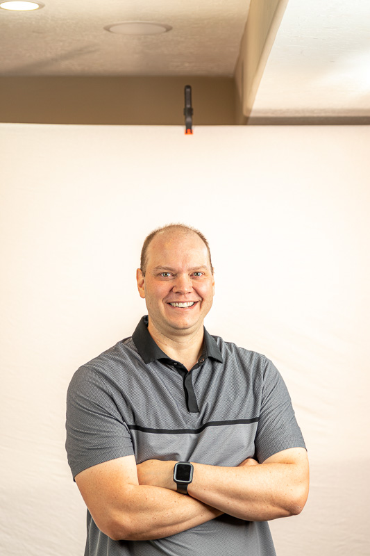
When a photography talks about a composite they are talking about taking the subject out of one photo and pasting that subject onto another photo. As an example, here is a photo of me I took in my basement with a white background:
And this a background for a headshot I had to do for a client recently:

After “extracting” me from the first photo and putting me on the background I get this:

Or, because I “extracted” my image from the background I can easily apply a different background:

Why Are Green Backgrounds Used With Composite Photos?
There are a lot of choices with regard to what color background a photography uses to do a composite. You may not have known the term “composite” before finding this post, but I bet you already knew that green is very commonly used when you want to replace the background with something else. The weather folks on news stations use them. Shooting for CGI in movies uses them. It is pretty common knowledge that green is what you use for that purpose.
Green is commonly used for composite work (video and stills) because it is uncommon to find that color in the model in front of the background. A person doesn’t often have green skin, green hair, or even green clothing. Especially not the neon green that is used in the background. The idea is to make it as easy as possible to remove the green color from the photo (or video) and leave the things you want.
How Do You Remove the Background For A Composite?
To remove a background for a composite photo, you are going to need to use Photoshop. If Photoshop is something that scares you then this is an excellent opportunity to have a specific project to teach you how to use Photoshop and overcome that fear. You should check out this post and podcast episode Taking the Intimidation out of Photoshop With Aaron Nace.
As learning things in Photoshop goes, this skill to remove a background is fairly easy. You have to learn selection and layers, two things you will need for nearly anything you want to accomplish in the future. The process is called “extraction” because you are extracting the model or subject in one photo and placing that extraction onto another background. Like in my example above I took a photo of myself on a white background (we’ll talk about why I chose white instead of green below), extracted myself from that white background, and placed that extracted image onto a grey background.
One of the reasons photoshop feels intimidating to so many when they get started is that there is always more than one way to do something. That is true here as we talk about extracting for a composite photo but there are four basic steps involved in the “extraction” process:
- Select the model/subject and NOT the background
- Copy the pixels in that selection
- Past the pixels onto another background
- Adjust the pasted pixels to have them match the background
The details of how to do that are different based on what you are starting with, how easy it is to select just the model (especially around very fine or semi-transparent details like hair or glass), and where you are pasting those pixels. This isn’t a step-by-step guide for doing an extraction, I want to talk about the color of backgrounds to use here, but you should look into these tools and learn how to use them in Photoshop:
- Quick Selection
- Select by Color Range
- Select by Luminosity Masking (check out the Lumenzia plugin)
- Refining selections using the Select and Mask Workspace
- Adjustment layers, especially Hue/Saturation, Levels, and Brightness/Contrast
- Layer Masking
Why Should Beginners Should Use A White Background For Composites?
I have done a lot of work with composites. I have done team and individual photos for local high school basketball teams for several years, compositing them onto backgrounds that look like magazine covers and other graphics. I have used both white and green backgrounds and my recommendation for someone who has never done a composite is to shoot your model against a white background like I did in my example.
White is FAR more forgiving as a background. Lighting and other mistakes result in a salvageable shoot where I have had many shoots with a green background require extreme editing. You remember the reason that professionals use green backgrounds is that the green doesn’t naturally occur very often in the models we shoot. That should make it easy to extract the model off of the green, but it also means that if you leave a little bit of the green in your extraction it becomes TOTALLY obvious that the photo is a composite.
Green Background Versus White Background Composite Example
I got things setup in my basement to take the photos I needed for this post using relatively inexpensive lighting gear that a beginner is likely to have or can get without breaking the bank.
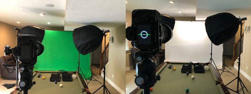
It was just me doing everything so I didn’t get my position perfect (thank goodness for controlling my Canon 80D through the iPad) but close enough to demonstrate the differences between green and white backgrounds:
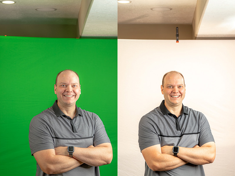
I left the lights in exactly the same position between the two backgrounds and tried to put myself in the same position. Then I extracted myself from both backgrounds and put the pixels on the same gray background:

Both look pretty good right? The lighting looks different on me because I wasn’t standing in EXACTLY the same spot with EXACTLY the same pose, but both are very passable as composite photos. The difference is the effort it took to extract me from the green background.
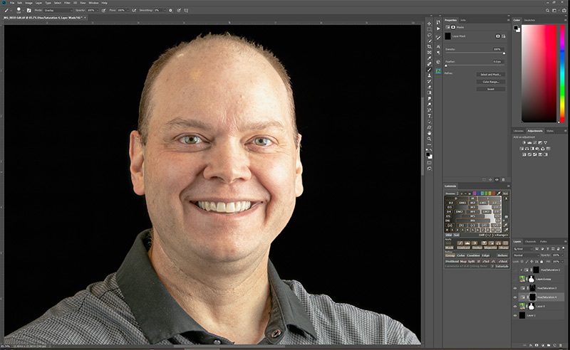
Take a look at the image below after selecting using Color Range (selecting green of course) and then doing a little bit of work with the selection in the Select and Mask workspace:
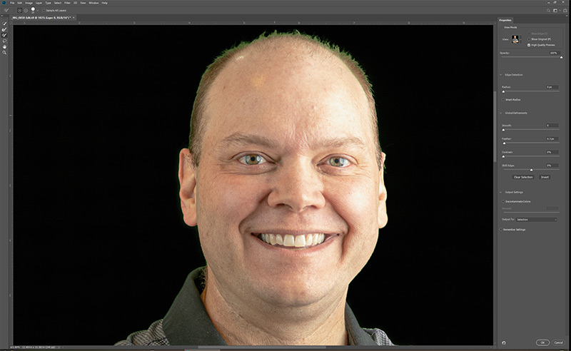
Obviously there is green surrounding what few hairs I have on the top of my head. It may be tough to see in the smaller image in the post, but there is also a little green in the collar on the left side. There is a little green in the highlights on the right side of my head as well. That little bit of green is called spill in composite work. There are some things you can do to limit the amount of spill that I will go through in a moment, though I have NEVER been able to eliminate it when using a green background.
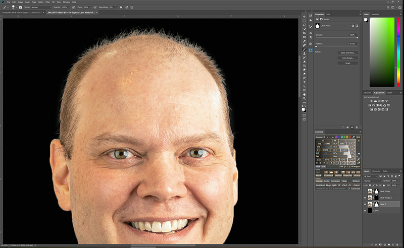
I fixed the spill using a combination of Color Range selection, Hue/Saturation adjustment layers, and layer masking to get this:
Fixing that green spill in Photoshop is possible but harder than selecting using the Quick Selection tool and then the Select and Mask workspace on the white background image:
If you shoot your model against a white background, you don’t have to get rid of all the white like you have to get rid of the green with a green background. If a little bit of white reflects on the model it all looks normal. A little extra white around hair looks like a hairlight and can be very passable as looking like those white pixels totally belong in the final image. It is harder to extract your model from a green background without including the green than to extract your model from a white background where you can leave a touch of that white and have it look just fine.
NOTE: I would NOT give the same advice for video work. There is a reason green (or blue) screens are used with video work and you have to get good at using green backgrounds if you want to do video composites.
Tips For Composite Success
A white background is more forgiving than green for still composite photos, but there are two things that are critical to giving you the best possible chance for success no matter the color of the background:
- Lighting, Lighting, LIGHTING!!!!
- Distance between model and background
By far the most important thing to giving yourself a good chance to create a successful composite is lighting. Start by getting even lighting on your background, something that I have found extremely difficult. Look at the lighting of the green screen in the image above. It may look like it is really even to you, but check out the image from the Green Screener app that shows you just how uneven the lighting was:
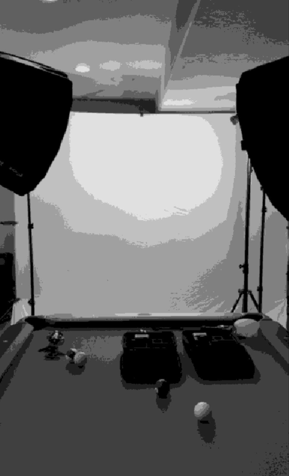
I used two YONGNUO YN216 YN-216 LED Video Camera ($55 each) constant lights power by DSTE Replacement for 2X NP-F750 Li-ion Battery ($25 for two) on the background in these photos. There are much better lights available but these are the least expensive I know of that do a really good job and are very portable. Still, they are small sources of light and won’t really light that background evenly. Even if you use flashes with softboxes to light the background it is tough to get it all lit evenly. You just do the best you can and give yourself a chance in post and using a white background is far more forgiving.
Before leaving the topic of lighting, you also need to consider the lighting of the new background. If the new background has a key light coming from right to left and you take your photo of your model with the key light going from left to right, it just won’t look right. The closer your can get your lighting in the photo of the model to match the lighting that was done with the new background the easier your job will be and the more convincing the result.
Finally, the mistakes I have seen made and done too many times myself is having the model too close to the background. There are two problems you get by having the model closer than about four or five feet from the background – more spill of color from the background and shadows on the background. Both can be dealt with in Photoshop with still images (not nearly as easy to work with in video) but you have a better chance to make things look great and have less editing to do if you can get that model as far away from the background as possible.
Reminders
- Photo Taco Facebook group, ask to join and write “Jeff Harmon” as the name of the host.
- Follow the show on Instagram @phototacopodast or Jeff’s personal account @harmonjeff
- Follow the show on Twitter @phototaco or Jeff’s personal account @harmon_jeff
- Send email suggestions on show topics to phototacopodcast@gmail.com
- Check out the other podcasts on the Master Photography Network over at masterphotographypodcast.com
Podcast: Download (Duration: 55:52 — 38.6MB) | Embed
Subscribe: Spotify | TuneIn | RSS
Comments
Thanks for doing the hard work for all the rest of us. I am a beginner even though I have 46 years of photography experience with my hobby. That’s because I have very little experience with the digital post processing needed to use the tools available to photographers today.
I am making a switch from Adobe products to Capture One. I shoot Nikon and (mirrorless) Fuji and have come to believe that this change will meet my needs going forward.
Have you thought about doing the same type of thing for Capture One as you have for Lightroom and Photoshop? I have not found a podcaster or YouTuber that is currently providing this type service for us using Capture One.
Again, thanks for all your efforts. You do what you do in a way that is unique. (and would benefit those “beginners” using Capture One, hint-hint hint 😄)
Pingback: Six Creative Portrait Images With Connor Hibbs - Master Photography Podcast
Pingback: Getting Started With Team Sports Photography - Photo Taco Podcast